Unit 5
VFX/SFX
Analysing lighting techniques in film

In this first scene that I have chosen from fear street part 3 the lighting would be described as low-key lighting due to the overall darkness throughout the scene. This help reflects the scene due to some very bad information being shared in it. In general they use soft lighting to show the comfort of her living room and have a practical lighting fixture of a lamp in the scene that brings a warm glow to further show that it is a comforting area that she uses often. However the lamp is not the only light in the room. We can infer that by the light that reflects on her face, I think they used a lighting fixture to bring light on the subject and maybe a type of diffuser to be able to give it that soft light. The light has a very warm glow in this scene directly contrasting the situation. Showing this bad information being told in a comfortable living room can put the viewer on edge because now nowhere is safe from bad stuff including their homes. The director creates more of a steep fall off in the scene, this can make it feel more serious and dark because you cant see part of the characters face stopping the emotion from being shown. This can make a character seem more threatening because now their face is unclear which can mean a literal double side to them we have never seen before. The scene has an overall colour to it, that colour being orange, however the colours are not very saturated so it feels very natural and realistic to everyday life. The main colour we see is orange however we also see a lot of green in this scene as well, green can represent evil which greatly contrasts with the warm glow of the orange telling us that stuff isn't necessarily good right now and bad stuff is coming.

In this scene in fear street 3 i would say the lighting is lowkey in terms of how dark the image is overall. However it uses hard lighting, the character has a hard dark blue light shone on to him, this intensity of light acts like a spotlight not giving him anywhere to hide. I don't believe that this light would be shone through a diffuser due to the intensity of the light. They have a small practical lighting fixture of a LED sign that creates a small contrast in colour making the shot more interesting. The director has a shallow fall of used in terms of this character which usually doesn't make sense because the evil character normally has part of their face hidden in shadow to insinuate that this person can not be trusted, however in this scene we don't have the shadow to show how now it is out in the open that he is a bad person. The scene has a very obvious very vibrant overall colour to it which is blue. Blue can generally show how isolated a character is which helps play into this scene with how the person is shot alone. With the blue light almost working like a spot light to single him out it helps the movies narrative that he is the bad character that works alone. Blue also generally creates a cold feel to a scene and when a person has a cold heart they have no compassion and are heartless this is well shown in this scene.
recreating lighting in scenes

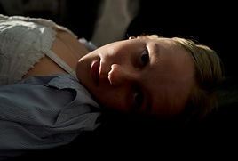
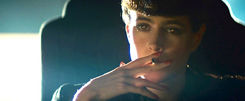


we started with creating an area for Ati to be able to lie down on a table and then set a panel light up where we believed that the light was pointing. then cara figured out the right height and distance for the camera with handholding the camera. then we took a couple of shots and realised the light was different so then we figured out the actual right lighting. then we realised we needed to create a black backdrop for ati to be against to stop the White walls from bouncing light into the shot. once we sorted all that out then we took the shot and moved onto the next one.

we started by finding a tall chair for sam to be able to sit in, the chair was see through so we placed a black blanket on top of it so the light didn't shine through. we then started working on getting the big whit panel light in the right spot. once we figured out where it went then we started placing sam in the right position and making sure the camera was in the right spot. we then realised that part of the background is blue so we got a small LED light and lite the background blue. once we done that we took the photo and moved onto the next one.
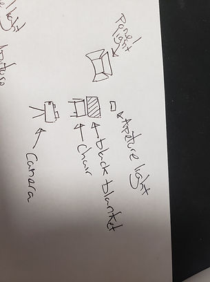
we started by trying to figure out what the hand is against in the scene and where the light was coming from. once we managed to figure that out we thought about where we would put my hand. we started with putting my hand near the wall but we quickly realised that it wouldnt work. we then got a little bit of help and realised that using a diffuser could help us get that ombrey withought lighting the hand. then we set up the shot and got the apetur light in the right colour and right position. then cara put the camera lens onto a blue setting and we got the shot.

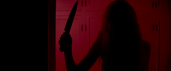

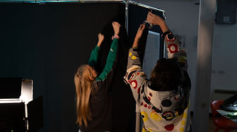
we started with putting a black blanket onto a whitebourd to create the divide and tried to figure out how to get the red light. we ended up using a panel light with a red filter in front of it and a small apeture light as well. we then struggled with the lighting position and not having it also light up the subject but then we figured out that the light should be a lot further away from the subject. once we figured out the right spot for the light we tried to figure out the correct camera angle we strugled to get it right though and then we realised that are subject was too tall so we switched her out for ati and then got the shot.

recreating lighting in scenes bts


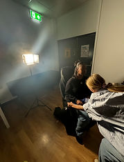


creating lighting based of prompts
we started by setting up a black background we used the back of a different groups black background and then also set up a white board covered in a black blanket to block out other lights. we then went outside and picked a few leaves and branches to be able to shake and make it seem like Sam was in a forest. we then set up the panel lights to give it a bit of light/ look like moonlight, we also set up the aperture lights and found a lightning feature so we set that to face Sam. we then got a big piece of cardboard and had someone flap that to seem like wind. we then hit record and shake the leaves around and through them at Sam to make it look even more windy.
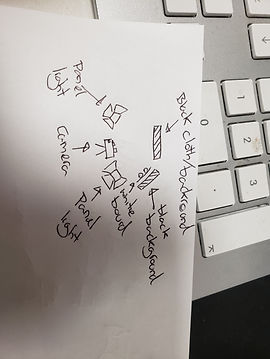
we carried on using the black background too make it seem like night and then started figuring out what to do with the lights. we found out that the aperture light had a setting that simulated a crackling fire but we didn't find it intense enough so we used the setting but also had someone under the camera moving it about. we then realised that we wanted the camera to look up at the person so it seemed like i was looking down into the fire, so we shortened the camera stand to the lowest it could go. we then realised that it was missing the moonlight so we had someone hold a blue light down to look like the moon. we then shot the video and realised it looked even better when there where hands in front of the camera so we took another shot.

we decided to keep the black background that we had used in the previous videos to make it seem like night time. we then planned out what kind of thing we think ati should do and decided on her running from the police and getting caught in the spotlight. once that was done we figured out how to get the lights of the police. there was a setting on the aperture lighting that made it look like police sirens and we had two of them pointing at ati. we then got abby to stand on a chair with a white aperture light that she moved to point at ati halve way through the clip.
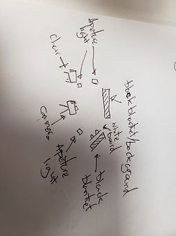
we stuck with the black background to make it look like sam is in night and then started figuring out how to make it look like moonlight. we had a blue aperture light below her to give a watery glow. we then found out that if we shined a torch through a water bottle on to sam's face then we could make it look like the movement of water is reflecting onto her. we then got Cara to hold a small white light near the top left of the screen to look like the moon. we then had to figure out where to position Sam and the camera so the floor wasn't visible. once that was done we shot the video.

creating lighting based of prompts bts
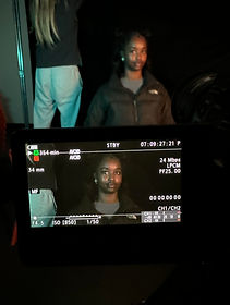



short film

lighting plan
lighting in the short film

in this scene we used practical lights to light up this scene and make it feel more realistic. the light we used is the big main light on the ceiling.
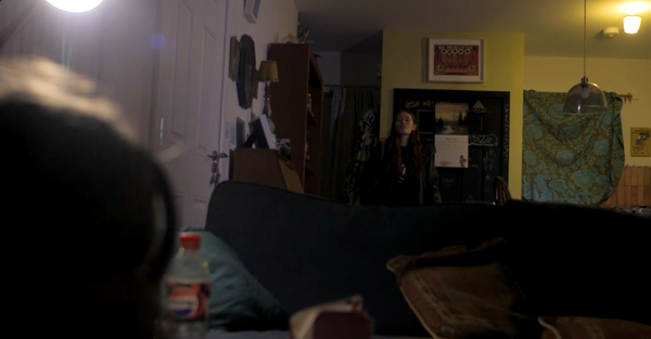
in this scene we used mainly practical lights to light up the shot. in this shot you can see the main light in the kitchen being used and a lamp to the side being used. however in other shots in this scene we used a panel light in replace of the lamp.

in this scene we used mixture of lights to light it up. we have a practical light lighting up the room behind it, the practical light was the main light in bedroom a. then we also have a lamp on the bedside table with a cover that makes the light green. we also had a small aperture light pointed directly at the actors face with a golden yellow glow to give her face a bit more light. we made sure the aperture light wasn't to bright so it wasn't to obvious there was more unrealistic light in the shot.
evaluation
In one scene we used a lamp in some shots and then tried to use a panel light to replicate it in other shots. this caused shots in the same scene to look different in there quality, next time we will make sure to keep with the same lighting so the quality doesn't change. in some shots we weren't very careful and you can see the panel/aperture lights and the tinfoil. this made it difficult when it came to editing because we had to either cut shots or use complicated ways to fix it, for example i had to use ai to get rid of some of the tinfoil shots. next time i will make sure that i keep a look out for anything that accidentally made the shot. it was annoying because we had to use tinfoil to make it seem like night. but lots of little where still visible through the tinfoil, but it did still look light night in the end which was good. We weren't afraid to let the scenes be dark which i think added to the aesthetic and will be bringing into my future projects. we used a lot of practical lighting which helped give it a realistic feel. i will carry on to use practical lights in future projects after seeing how well it worked in this film. in the bathroom scene we used the practical light and it worked very well, because she turns the light switch on herself we didn't want to use a panel light because we knew we wouldn't be able to get the timing right. i will bring the knowledge that using physical lighting can work just as well. we used an aperture light for the scene where she opens the door and it worked really well, it gave it a clean light/shadow. however the aperture light and the practical lighting we used in the scene didn't match up from shot to shot, because of this i had to colour grade the lighting to look similar in the separate shots. next time i will make sure to match the lighting so i don't have to edit it later. overall the lighting looked good in the film but there where little problems that i will make sure to avoid in later projects.